Lettering
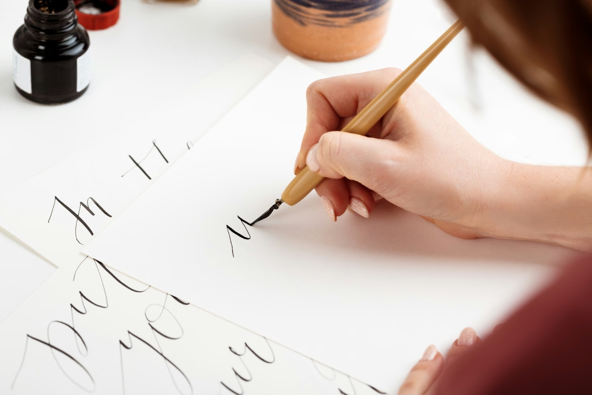

Lettering is the art of drawing letters, not writing them. Each piece is created as a unique graphic composition for a specific task and is not set in a ready-made typeface. Letters in lettering are designed by hand: first the skeleton of the sign is built, then the form, contrast, and decoration. The finished composition exists in a single copy — it cannot be reproduced by typesetting.
This article covers what lettering is, how it differs from calligraphy and typography, which styles are in demand, where a hand-drawn inscription works better than a typeface, and how to master the craft from scratch. The material is for designers who want to understand the difference between the disciplines and apply lettering deliberately.
What Lettering Is
Lettering is a direction in art where letters and compositions with them form the basis of the creative idea. Its characteristic feature is that letters are drawn by hand and are themselves artistic objects. The author has complete freedom of expression: form, rhythm, contrast, and decoration are subordinated to the idea, not to a typeset font.
From a technical standpoint, it is a process of design engineering. The specialist works with symbols as with architectural objects: builds a balanced structure, thinks through the form of each element, rhythm, contrast, negative space inside and around the signs, and interaction with the medium. Each commercial work is a unique solution subordinated to a business task.
Creating a quality inscription requires an understanding of proportions and command of digital editors. Turning an idea into a scalable vector object, the designer erases the line between text and illustration. Custom visuals increase brand recognition and set it apart from competitors using stock typefaces.
How Lettering Differs from Calligraphy and Typography
The three related disciplines are often confused. The difference lies in the process, purpose, and tools.
- Lettering — drawing letters and creating a unique inscription. The focus is on building form, composition, and decoration. Each project is unique and not repeated.
- Calligraphy — the art of beautiful writing. It is based on the rhythmic writing of symbols with a pen or brush pen. The value lies in the live stroke and variable pressure.
- Typography — formatting text with ready-made typefaces. The specialist works with existing fonts, adjusting kerning, tracking, and leading for readability.
This feature distinguishes lettering from typography, where the main attention is paid to the type composition or the arrangement of a ready-made font. Typography is the art of formatting printed text with strictly defined parameters; its main tool is the typeface. In lettering, the artistic idea is decisive.
Lettering should not be confused with calligraphy either, although both phenomena are connected with the art of writing letters. Calligraphy is characterized by writing itself, while in lettering the main role is played by drawing, individuality, and authorial style. In calligraphy, uniqueness is not decisive: the created font can be used many times in designing postcards, greetings, and posters.
Comparison of Disciplines
| Criterion | Lettering | Calligraphy | Typography |
|---|---|---|---|
| Process | Drawing and building contours | Writing according to the tool's rules | Formatting a body of text |
| Purpose | Unique graphic composition | Rhythmic and aesthetic handwriting | Readability and UX |
| Tools | Vector editors, tablet, liners | Pens, brushes, brush pens | Layout editors, CSS |
| Repeatability | Each project is unique | Variability within a style | Full identity of symbols |
A Brief History of Lettering
As an independent commercial tool, lettering was shaped by the evolution of advertising, although the origins of the direction are connected with the development of writing.
- Antiquity and the Middle Ages. In manuscripts and medieval codices, scribes created unique initial capitals that served as navigation through the text and were full-fledged illustrations.
- The 19th century — the era of the poster. The Industrial Revolution gave impetus to outdoor advertising. Artists designed accent type compositions for posters by hand. Some art historians link the emergence of the phenomenon to the posters of Alphonse Mucha and the playbills of Henri de Toulouse-Lautrec.
- The mid-20th century — the golden age of branding. With growing competition, custom inscriptions became the basis of logos. The marks of Coca-Cola, Ford, and Disney were drawn by hand: designers verified every serif so that the graphics became the foundation of the corporate identity.
- Soviet lettering. The phenomenon became widespread in the mid-20th century, partly thanks to Soviet designers. Lettering found application on signs, leaflets, and posters. Soviet lettering took shape in the 1920s under the influence of ideology, the country's isolation, and limited visual techniques. Social posters and propaganda materials became pioneers in the use of lettering; artists and decorators especially favored lettering stylized as handwritten text.
- The late 20th century — the digital revolution. The introduction of vector graphics moved the industry onto screens. It became possible to scale curves without loss of quality, which optimized the transfer of layouts to print and the web.
- The present day — a new wave of handcraft. In an era of template solutions, the value of the craft approach has grown. Chalkboards in HoReCa, custom prints, and authorial packaging demonstrate high demand for personalized design.
The basic principles remain unchanged: rejection of typeset fonts in favor of unique drawing and formation of a whole, inseparable composition from symbols.
Where Lettering Is Applied
The areas of application of lettering are expanding along with the growth of the advertising, printing, and marketing technology market. An inscription works not only for direct marketing communications but also as a dialogue with the consumer: it forms stable associations with the brand and positive emotions in response to the advertised product.
- Product identity. Artistically designed letters are used in developing logos, brand inscriptions, and printing. Drawn logos scale across all POS materials, uniforms, and web interfaces.
- Posters, placards, postcards. A historical format that does not lose relevance. Vladimir Mayakovsky in the 1920s used this method to create the "ROSTA Windows".
- The film industry. Design of titles and posters. Custom headlines set the genre tone before viewing begins.
- Clothing and merch. Prints on hoodies, T-shirts, and accessories are often based on authorial typography. Inscriptions have become more diverse, letters more creative; they have moved from T-shirts to other items of clothing.
- Interior and decor. Lettering has stepped far beyond photo frames and picture frames. Artistically drawn letters are integrated into furniture, decor, home textiles, and lighting elements. Navigation and decor in HoReCa, bar menus, shop windows.
- Outdoor advertising. Billboards, city formats, sandwich boards.
- Web design. Authorial headlines on landing pages visually engage the user on the first screen.
- Packaging. Packaging design for products, gifts, and cosmetics often includes lettering — the product becomes more attractive and memorable.
- The tattoo industry. Type compositions on skin require an understanding of anatomy and body dynamics.
- Festive attributes. Invitations, signs, menus, and other elements of festive decor emphasize the style and atmosphere of the event.
In performance marketing and branding, the integration of drawn elements solves specific business tasks: differentiation from competitors (copying a vector illustration is harder than buying a license for a popular font), CTR increase (non-standard creative breaks through banner blindness), perception management (brand colors combined with aggressive or soft letter forms directly influence the emotions of the target audience).
Types of Lettering by Method of Execution
At the current stage, lettering differs by methods of execution. Three main types are distinguished.
- Hand-drawn. Characterized by uniqueness and inimitable elements, most often used in creativity, hobbies, or in developing single artistic materials.
- Digital. The most common type today. Used when elements are planned for the digital environment: in developing a logo, website header, templates for authorial posters, business cards, and other products.
- Mixed. Involves the use of hand-drawn sketches with subsequent digitization and processing in a graphic editor.
Popular Lettering Styles
The modern world of advertising and printing numbers a huge variety of lettering types. Many compositions are created in a single copy, so it is practically impossible to list all styles. Below are the main directions in demand in commercial design.
Classical (Victorian)
The foundation of all styles: clarity, harmony, and balanced forms. Letters often have serifs that give elegance and rigor. Associated with tradition, reliability, and professionalism. Used in print publications, official documents, and advertising where seriousness and trust are important.
Gothic
Also known as "blackletter", it originates in medieval Europe. Characteristic features are narrow, elongated letters with sharp angles and complex decorative elements. Associated with gloom, mystery, and grandeur. Niche: craft breweries, barbershops, the music industry.
Handwriting
Imitates natural handwriting. It can be both neat and elegant, and careless and free. Deliberate negligence, broken rhythm, and varying character sizes convey sincerity. Used by local brands to emphasize handcraft and craft quality, in invitations, postcards, and personalized gifts.
Retro lettering
Inspired by the aesthetics of past decades: the 1920s, 1950s, or 1970s. Found on vintage signs, posters, album covers, and advertising announcements that were created by hand. It often includes textures imitating faded paint, scuffs, or scratches. Imitation of pre-revolutionary or Soviet signs, muted palettes, and scuff textures build trust through an appeal to tradition: coffee shops, bakeries, farm products.
Grunge
Characterized by negligence, roughness, and deliberate sloppiness. Letters may be distorted, with scratches, cracks, and stains. Associated with rebellion, freedom, and informality.
Graffiti
A combination of street art and typography. Distinguished by dynamism, expression, and freedom of forms: letters intertwine, outlines may be angular, rounded, or abstract. It can be both minimalistic and saturated with details — shadows, highlights, gradients, arrows, and drips. Used by youth brands, streetwear manufacturers, and energy drink producers.
Ethnic
Each letter is a story told through ancient patterns, ornaments, and symbols. Motifs of Slavic runes, Arabic script, Celtic weaves, or African petroglyphs. Requires a deep understanding of cultural codes.
Vector sketches
Created directly in the digital environment, distinguished by clean lines and minimalism. Used for IT products, app icons, and modern merch.
Silhouettes
Text fits into the rigid boundaries of a geometric shape or a recognizable object (a coffee cup, an animal). They work excellently in monograms, packaging design, and accent prints due to high contrast.
Volumetric lettering
Letters are drawn in three-dimensional technique, gaining volume and realism. Requires knowledge of perspective and work with light and shadow. Used in motion design, key visuals of advertising campaigns, and game dev.
Decorative
Integration of floristry, ornaments, and complex ligatures directly into the structure of the sign. Suitable for premium cosmetics packaging, confectionery, and event printing.
Gradient
Smooth color transitions within the contour. Optimal for interfaces, social media creatives, and technology startups.
Organic
Biomorphic forms: imitation of branches, paint drips, cellular structures. In demand in the niche of eco-products, vegan products, and yoga studios.
Techno and digital
Neon glow, glitch effects, strict geometry, chrome textures. The choice of esports teams, crypto projects, and hackathon organizers.
Dark lettering
Aggressive forms, spikes, cobwebs, high density of black color. Niche: underground clothing brands, metal bands, horror quests.
Main Lettering Trends
The digital design market dictates strict requirements for interactivity and production speed. Three key vectors.
- Volumetric lettering and AR integrations. Volumetric textures (liquid metal, glass, inflatable elements) go beyond flat screens. In e-commerce and outdoor advertising, augmented reality is being introduced: the user points a smartphone camera at a marker, and a volumetric inscription unfolds in space. This multiplies the time of contact with the brand.
- Kinetic (animated) lettering. Static loses to dynamics. Inscriptions react to scroll, cursor hover, or device gyroscope. When integrating such solutions on the web, it is critically important to observe loading speed metrics: animations are exported in economical formats, compressed by modern algorithms, and for fallback fonts the font-display: swap property is prescribed.
- Symbiosis of handcraft and AI. Generative neural networks are used at the mood board stage to quickly find compositional hypotheses. However, the final drawing, curve cleaning, and vectorization remain with the human. The macro-trend "imperfect by design" (deliberate imperfection) protects the profession from full automation.
How Commercial Lettering Is Created
Work on a type composition is a strict process, not chaotic creativity. The process is divided into four stages.
Step 1. Brief and Mood Board
Collection of input data: positioning, target audience, media. A reference list is formed to synchronize the expectations of the customer and the art director.
What is checked in practice: the brief is recorded in writing — if the customer "changes their mind" a month later, the written inputs protect against endless revisions.
Step 2. Skeleton and Composition
Drawing the basic framework. Proportions, slope, rhythm, and kerning are verified. 1–2 draft sketches are presented to the customer.
What is checked in practice: at the sketch stage, black-and-white versions are shown — color masks a weak form.
Step 3. Building Up the Form
Detailing the approved sketch. Contrast of strokes, ligatures, and decorative elements are added. Readability is tested in micro-sizes, for example for a favicon.
What is checked in practice: the inscription is tested in real sizes — on a business card, avatar, sign, and not only on a large screen.
Step 4. Digitization and Vector
Transfer to the digital environment. If collaboration and approval of layouts with the customer are required, an editor with a multi-user mode, comments, and code transfer is used. If a full-fledged font is planned to be developed on the basis of the inscription, specialized software is connected. The final package of source files is strictly regulated: fonts in curves, EPS and PDF for printing, SVG for web integration.
What is checked in practice: the sign is checked for scaling — from favicon to banner, without loss of readability.
How to Learn Lettering: A Guide
Mastering the skill requires systematic practice. The basic algorithm is below.
Step 1. Studying the Grapheme
A grapheme is an abstract "skeleton" of a sign that determines its recognizability. Without understanding the construction, decoration is meaningless.
Practice: print a word typed in a grotesque font, trace each symbol with tracing paper, analyzing stroke thickness, internal letter spaces (aperture), and extender elements.
Step 2. Basic Toolkit
Expensive markers are not needed to start. The minimum set:
- pencil (softness B or 2B) for sketches;
- kneaded eraser that does not damage the paper;
- liners (0.1, 0.3, 0.5 mm) for contours;
- brush pen for pressure training;
- thick paper — watercolor or drawing paper;
- ruler and square for even lines;
- white gel pen or correction pencil for accents.
Practical task: take a brush pen and train basic strokes daily — draw thin lines upward without pressure, thick lines downward with effort. This sets the hand and teaches control of the tool.
Step 3. Digital Tools
After mastering paper — transition to the digital environment. For understanding the software — the table.
| Program | Purpose | Advantages |
|---|---|---|
| Adobe Illustrator | Vectorization, logo creation | Ideal work with Bezier curves, industry standard |
| Procreate (iPad) | Raster sketches, brush lettering | Natural drawing feel, huge brush library |
| Figma | Web integration, presentation to the customer | Cloud collaboration, SVG export, Dev Mode |
| Glyphs | Creating typeset fonts | Professional functionality for type design |
Step 4. Regular Practice
Lettering requires constant practice. Drawing should be given time every day, even if it is 15–20 minutes. Analyzing the work of experienced authors helps to understand style, composition, and the use of fonts. Thinking through the concept before drawing determines what emotion or message the inscription carries and how this is expressed through the form and style of letters.
Mastering basic techniques — straight lines, circles, and other shapes — develops control over the hand and precision. Experiments with styles, line thickness, letter slope, and decorative elements help to find a unique style. Sketches before the final work elaborate the composition and avoid mistakes. References from nature, architecture, fashion, and art give new ideas.
What is checked in practice: the simplicity test — show the inscription to acquaintances and ask them to draw it from memory. If it works out — the composition is simple and memorable.
Frequently Asked Questions
Is lettering a font?
No. A font is a set of ready-made letter forms that are reused in different projects. Lettering is unique and created for a specific task. If a font is a ready-made tool, then lettering is an individual work that adapts to the context or idea.
Are lettering and calligraphy the same thing?
No. Calligraphy is the art of beautiful writing, where letters are created by hand with a pen or brush. Lettering is the drawing of letters, where each is created as a separate graphic element. In calligraphy, the technique of writing is important; in lettering — composition, style, and individuality.
Can lettering be mastered from scratch?
Yes. Mastery is built on systematic practice: studying the grapheme, basic toolkit, digital editors, regular exercises. It is worth starting with paper and simple strokes, then moving on to vector editors.
Where is lettering applied in commercial design?
In identity, printing, outdoor advertising, web design, packaging, clothing and interior design. Custom visuals increase brand recognition and set it apart from competitors using stock typefaces.
In Short
Lettering is the drawing of unique compositions, not the layout of ready-made fonts. Each inscription is created for a specific task and exists in a single copy. Lettering differs from calligraphy (writing) and typography (formatting text with ready-made typefaces) in process, purpose, and tools.
Inscriptions are used in branding, web design, outdoor advertising, packaging, and clothing design — for differentiation from competitors and perception management. The commercial process includes a brief, sketching, detailing, and strict vectorization with a regulated package of source files.
To start in the profession, it is necessary to study the anatomy of letters (graphemes) and master the combination of analog tools with vector editors. Regular practice, analysis of the work of experienced authors, and experiments with styles form a unique style.
Lettering  Color Wheel
 Brand Archetypes