Minimalism


Emma was a designer with over ten years of experience, but one day she faced a challenge that pushed her out of her comfort zone. She needed to create a logo for a new tech startup — something simple, modern, and memorable. Her initial drafts were full of details and colors, but the client just shook their head: “Too complicated, too cluttered.”
Emma didn’t understand why her usual techniques weren’t working. Then a colleague suggested, “Try the opposite — remove everything unnecessary. What remains if you keep only the essentials?”
That advice changed everything. Emma began trimming, simplifying, and crossing out, until only a concise symbol was left — clean, clear, and easy to recognize. The logo came alive, and the brand found its identity through minimalism.
This is how Emma discovered the core philosophy of modern design — where less truly means more.
What Is Minimalism in Design?
Minimalism is a design philosophy based on the principle "less is more." In graphic design, it’s the art of creating maximum impact with minimal means. Every element must have a clear function and purpose.
Simply put, minimalism is about cutting away everything unnecessary, leaving only the most important. It’s built on clarity, functionality, and focus on essence.
Minimalism requires deep understanding — you can’t just delete half the elements and call it minimalism. Every design choice must strengthen the main message. Beauty lies in harmonious proportions, not in excess decoration.
Core Principles of Minimalism
Minimalism in design rests on several key principles that allow for clear, concise, and functional visual solutions. These principles help achieve not only aesthetic simplicity but also user-friendly and effective design. Let’s explore them.
Simplicity of Forms and Lines
Minimalism emphasizes simple, fundamental shapes and clean lines. Instead of intricate details, designers use basic geometric forms — circles, squares, triangles — which create a clear visual structure.
Clean lines without unnecessary curves or decorations create order and harmony. They guide the viewer’s eye naturally without distractions.
Simplicity makes designs universal — easily understood across cultures since basic shapes are universally recognized.
Use of White (Negative) Space
White space is not just an empty background. It becomes an active compositional element that creates breathing room and lightness.
Effective white space reduces clutter, making design easier to read and more pleasant. It separates key elements, emphasizing their importance.
For example, a logo surrounded by ample white space becomes more noticeable and expressive. White space prevents overcrowding and visual chaos.
Limited Color Palette
Color is a powerful communication tool, and minimalism demands discipline here. Usually, a palette of one to three colors is chosen. Monochromatic schemes or soft neutrals are common.
Restrained color use focuses attention on form and structure without distraction. Black-and-white palettes are classic minimalism — timeless and adaptable.
Modern trends sometimes add a single bold accent color on a neutral background to create emotional impact and visual interest.
Minimal Number of Elements
Minimalism values quality and meaning over quantity. Only what’s essential to convey the idea or function remains.
The “one idea — one element” principle eliminates visual noise and clarifies the brand’s message. Hierarchy guides user focus.
Secondary details are removed or simplified to avoid distraction and overload.
Attention to Typography
With fewer decorative elements, typography becomes the main expressive tool.
Font choice, weight, size, and letter spacing create emphasis and direct attention. Contrasting fonts establish hierarchy without extra graphics.
Large, clear headlines and readable text improve comfort and underline professionalism.
Functionality and Integrity
The “form follows function” principle is central. Every visual element must have purpose. If something doesn’t improve perception, navigation, or recognition, it should be removed. Functional design enhances communication and speeds audience understanding.
These principles form the foundation of minimalism, shaping not just aesthetics but effective, memorable brands. Following them creates designs that are simple yet meaningful.
Minimalism’s Impact on Branding and Design
Minimalism improves brand recognition — simple shapes are easier to recall. Minimalist logos scale well and adapt to various media.
It also conveys premium quality, elegance, and modernity. Brands communicate their values clearly without distractions.
Applying Minimalism Across Design
Minimalism in Logos
When designing a minimalist logo, identify the core idea and express it simply. The logo should work well in color and black-and-white.
Good Examples of Western Brands
Apple — a simple, iconic apple silhouette with a bite taken out. Clean lines and monochrome colors make it instantly recognizable worldwide. The logo scales seamlessly across devices and media.
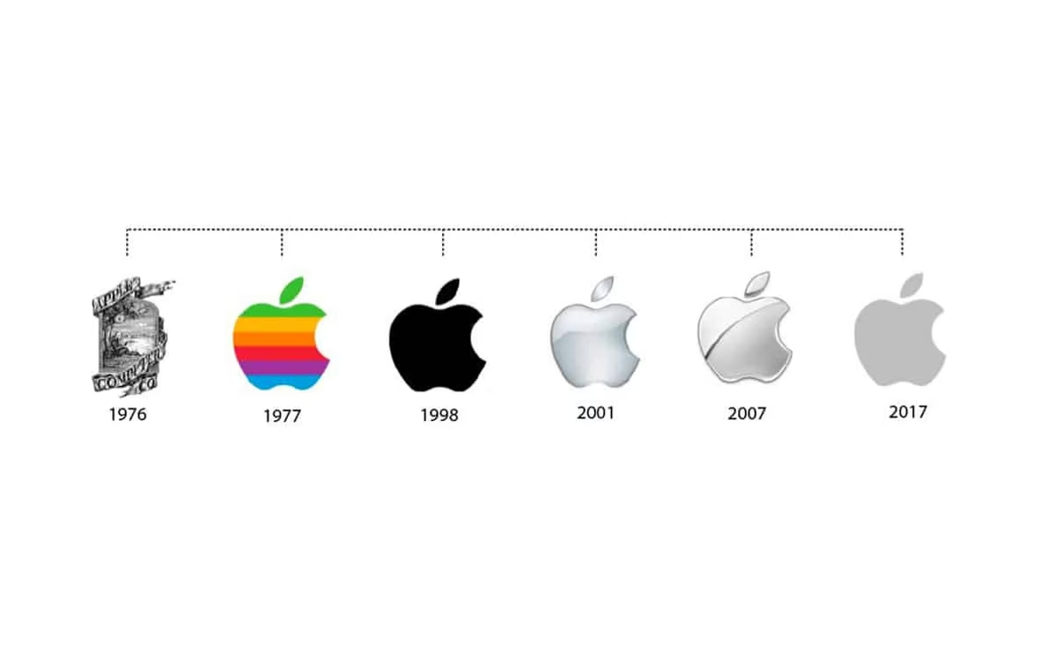
Source: Google images
Google — while colorful, Google’s logo uses a simple sans-serif font with minimal embellishment. Its playful yet clean design balances simplicity with brand personality.

Source: Google images
Airbnb — the “Bélo” symbol combines simple curves into a distinctive, memorable shape representing “belonging.” It’s clean, versatile, and modern.

Source: Google images
Examples Where Minimalism Didn’t Work — Why They Aren’t Minimalism
Minimalism is more than removing details — it’s purposeful reduction that keeps meaning and recognition.
Some redesigns misinterpret minimalism:
Gap (2010 Redesign) — the new logo stripped away the classic serif font and iconic blue box for a simpler sans-serif wordmark with a small blue square. It was widely criticized for feeling generic and losing brand identity, causing a quick reversal. This “minimalism” lacked personality and recognition.

Source: Google images
Mastercard (2016 Redesign) — the removal of the intersecting stripes between red and yellow circles simplified the logo, but some argued it reduced visual interest and brand uniqueness. The redesign leaned too far into flat minimalism, risking blandness.
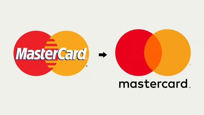
Source: Google images
Tropicana (2009 Redesign) — an attempt to simplify packaging and logo resulted in confusion among customers who couldn’t recognize the brand, leading to a swift return to the original design. This was oversimplification that harmed brand clarity.
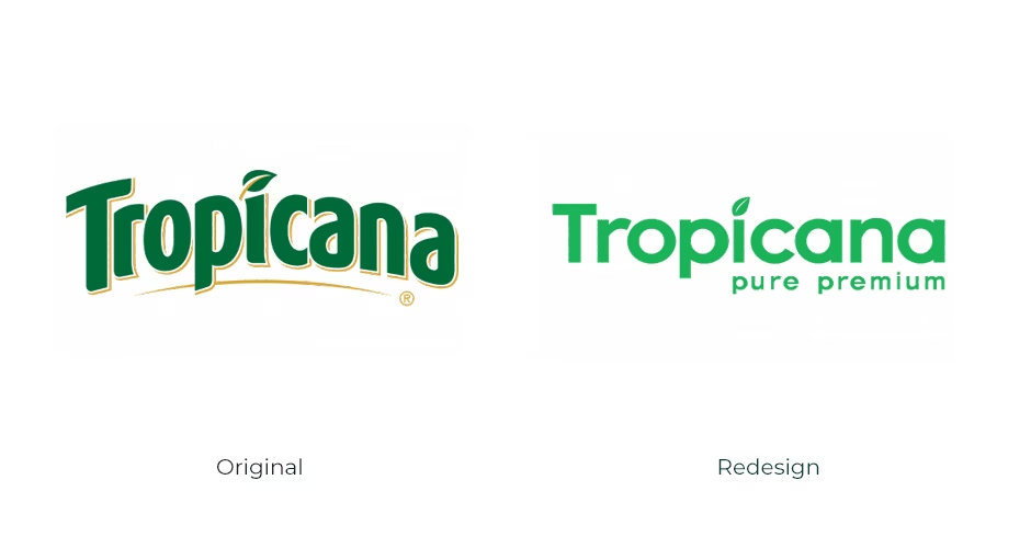
Source: Google images
Tips to Avoid Mistakes in Minimalist Redesign
- Preserve meaning and recognition. Don’t remove core brand elements.
- Ensure readability on all sizes and devices.
- Prioritize functionality. Each element must serve a purpose.
- Use balance and proportion. Minimalism is harmony, not emptiness.
- Test with diverse audiences for clarity and memorability.
- Maintain emotional connection; simple doesn’t mean cold or impersonal.
Minimalism Trends
Tactile minimalism: subtle textures and soft finishes for warmth and depth.
Soft minimalism: warm natural tones and organic shapes.
Bold accent colors: one vivid hue on a neutral backdrop.
Asymmetric minimalism: dynamic layouts with simple forms.
Micro-animations: subtle motion enhancing UX without distraction.
Neural Networks in Minimalist Design
AI tools help generate simple shapes, choose optimal color palettes and fonts, and automatically optimize layout respecting white space principles.
Examples include AI-driven logos and brand elements from platforms like Looka, Canva’s AI, and custom tools like Nikolay Ironov’s neural network.
These are few examples:

Source: Ironov Portfolio

Source: Ironov Portfolio

Source: Ironov Portfolio
Conclusion
Months later, Emma looked at the logo that once seemed too simple. Now the symbol was recognizable, light, and clear. Customers mentioned the brand more often, and the team felt proud.
She remembered her first attempts to add details — and how she learned the power of minimalism. Minimalism became her design philosophy — concentrating ideas and making them universally understandable.
In a world flooded with visuals, minimalism helps brands speak clearly and confidently. It’s not loss but gain of meaning. For Emma and many designers and companies, minimalism is the key to a strong, relevant, and memorable brand.
 Target Audience
  Branding
  Golden Ratio