How the Logo and Corporate Identity Affect Brand Recognition

Brand recognition is an essential factor for success in modern marketing. It is shaped by visual elements such as logos and corporate identity. When these elements are harmoniously developed, they help the brand stand out among competitors, become memorable, and evoke positive emotions. Let’s explore how logos and corporate identity impact brand perception and provide recommendations for creating them.
Logo: The Face of the Brand
The logo is the primary element associated with the brand. It not only represents the company but also serves as a "flag" that instantly brings specific images, values, and emotions to mind. The logo should not be overloaded with details—its strength lies in simplicity and symbolism. When viewed for just a fraction of a second, it should trigger recognition and be understood even without the company name.
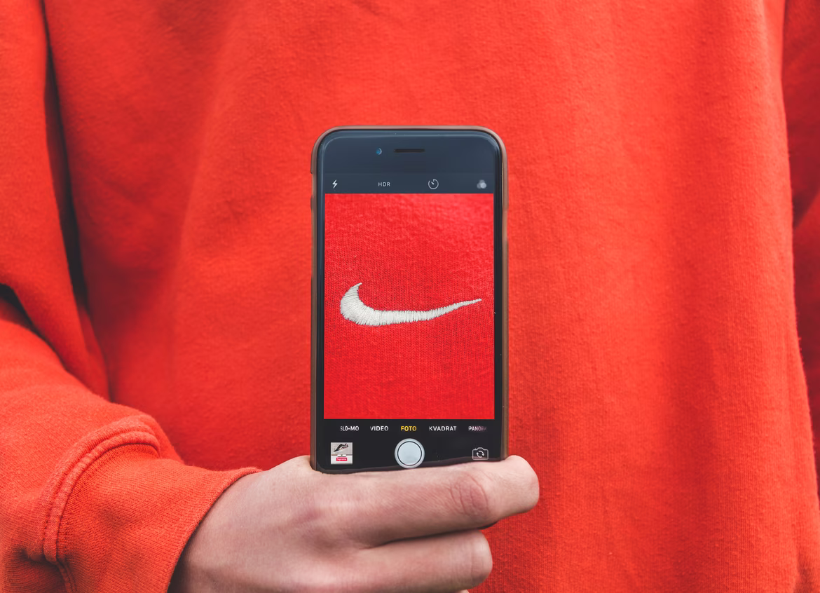
Iconic examples include the Nike checkmark, McDonald's golden arches, or the bitten apple of Apple. These logos are so powerful that one glance is enough to immediately identify the brand. Logos can convey not only visual information but also the company's culture. For example, Apple’s minimalist design emphasizes innovation and simplicity.
 .
. 
Source: Wikipedia
It is essential to understand that a good logo must be versatile. It should look equally good on a large billboard, a business card, a mobile screen, and even in black and white. When designing a logo, this flexibility must be built into the design.
Additionally, the logo can serve as a cultural marker. For example, the Chanel brand with its intertwined "C" letters symbolizes not only fashion but also a lifestyle associated with luxury, elegance, and style.

Source: Google картинки
Practical Tip #1: The logo should be simple and easy to remember, making it easy to reproduce in any format.
Color Palette: Emotional Impact
Colors play a decisive role in brand perception. Different color schemes can drastically change how a brand is felt, helping to set the audience's emotions. Color psychology is a powerful marketing tool that can enhance brand recognition and trigger the right associations.
For instance, red is often associated with energy, passion, and even aggression. Therefore, brands in dynamic and emotional sectors (such as Coca-Cola or Ferrari) often choose red as their primary color. Coca-Cola, in particular, uses a bright red to associate with fun, celebration, and youthful energy.
Source: Google images
On the other hand, blue is more often associated with trust, stability, and professionalism. That’s why many financial and technology companies, like IBM or Visa, make blue a key color in their branding.


Source: Wikipedia
Green traditionally symbolizes eco-friendliness, nature, and health. Brands that aim to emphasize their commitment to sustainability or environmental values often choose it as their primary color. Starbucks, for example, combines green with white to underline its connection to environmental responsibility.
Source: Wikipedia
The color palette can be more than just a set of vibrant colors—it can also be part of the brand's communication with its audience. It's crucial that the palette aligns with the overall visual identity and supports the brand's values. For example, a brand that emphasizes tradition and reliability is unlikely to choose acidic neon colors.
Practical Tip #2: Before selecting a color palette, it’s helpful to conduct research to understand which emotions a particular color combination evokes in the target audience.
Fonts: The Brand’s Character Through Typography
The font also carries important meaning, reflecting the brand's character. Classic, strict fonts convey authority, while lighter and more playful ones emphasize creativity and freedom. Well-chosen typography enhances the overall impression and helps solidify the brand's image.
Practical Tip #3: For corporate identity, it’s recommended to limit yourself to two fonts: one for the main text and another for accents.
Brand Elements: Unique Details
Brand elements are visual details that complement and enhance the overall brand image, giving it uniqueness and memorability. These elements help create the atmosphere the brand wants to convey to its audience, making it more expressive and distinct among competitors.
Patterns
Patterns, or repeating designs, can be an important part of a corporate identity. They can be used for backgrounds in marketing materials, on packaging, or in mobile applications. Patterns help strengthen the brand’s visual perception and make its style more cohesive. Often, they are used in addition to the main logo elements, adding depth and dynamism. A well-designed pattern can become so recognizable that even without the logo, it will be associated with the brand. For instance, Burberry is known for its distinctive checkered pattern, which has become one of the brand’s symbols.
Icons
Icons are small graphic elements that serve a functional role by facilitating user interaction. But they can also be part of the visual identity. A simple, yet stylish set of icons can enhance the brand’s perception and create a sense of unity. It is important that the icons are not only aesthetically pleasing but also universal, understandable, and functional. For example, Apple’s icons in their apps and websites have a minimalist and stylish appearance, which aligns with the brand's overall philosophy—simplicity and elegance.

Source: Wikipedia
Illustrations
Illustrations are another important element that adds personality and emotion to the corporate identity. The use of unique illustrations allows the brand to stand out and create a deeper connection with the target audience. This is particularly relevant for brands that target creativity, youth communities, or unconventional marketing approaches. Illustrations can be used in advertising campaigns, packaging, websites, and social media, adding a light and playful touch to the company's image. Brands like Mailchimp use bright, fun illustrations in their visual content, helping to create a friendly and laid-back image.

Source: Google images
Graphic Elements
In addition to patterns, icons, and illustrations, other graphic elements, such as lines, shapes, and textures, can also play a significant role in the corporate identity. These elements are often used to reinforce the brand’s visual identity and give it a finished appearance. Graphic elements can highlight the brand’s style, from strict straight lines creating a sense of order and professionalism to soft, organic shapes that create a feeling of warmth and comfort.
Animation and Dynamic Elements
Modern brands are increasingly using animation and dynamic graphic elements to create a livelier and more interactive experience. Animation on websites or mobile apps, elements that appear smoothly, and micro-interactions can make interactions with the brand more enjoyable and engaging. This is especially important for digital brands that want to stand out online. For instance, Dropbox uses smooth animations that make the interface easy and enjoyable for users, while also adding a sense of "life" to the app.

Source: Wikipedia
These brand elements make the brand more expressive and unique, helping to strengthen not only the visual identity but also create a stronger emotional connection with the target audience. They provide flexibility in communication, allowing the brand to adapt to different channels and situations while maintaining recognition and integrity.
How Logos and Corporate Identity Help Brands Stand Out from Competitors
A unique visual image plays a decisive role in distinguishing a brand from a multitude of similar ones. It helps the brand immediately become memorable and remain in the audience's mind, making it easily recognizable.
It’s important to focus on how visual elements—logo, color palette, fonts, and other graphic elements—work in harmony. This creates an image that not only attracts attention but also evokes the right associations.
For example, Tesla has created a unique image associated with cutting-edge technology, eco-friendliness, and innovation. Tesla’s logo, done in a strict, minimalist style, reflects the brand's high technological standards, while the color palette and design of its cars reinforce the impression of modern and eco-friendly solutions. Thanks to the harmony of all visual elements, the company remains prominent, and its recognition grows even among those not interested in cars.

A visual image helps a brand stand out, but it’s also important that it’s memorable and simple. A good example is Nike, whose checkmark logo, despite its simplicity, has become a symbol of athletic achievement and ambitious goals worldwide.
Source: Google images
Brand Positioning Through Design
Design plays a key role in brand positioning because it is through visual elements that companies convey their uniqueness and values. A well-thought-out corporate identity provides a clear understanding of the principles behind the business, helping the target audience to form an emotional connection with the brand more quickly.
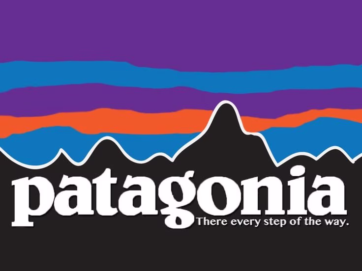
For instance, Patagonia, which targets environmentally conscious consumers, uses colors and shapes associated with nature in its design. Smooth lines, shades of green and blue remind of the natural environment, and the use of recycled materials in packaging emphasizes environmental responsibility. Through design, Patagonia expresses its commitment to nature protection, establishing a clear position in the market for eco-friendly products.
Source: Pinterest
Another example is Apple, whose strict, minimalist style emphasizes the value of simplicity, elegance, and innovation. Apple’s product design and corporate identity clearly position it as a leading player in the technology market, focusing on convenience and high quality. Here, the task of design is to highlight that technology should be intuitive and accessible to everyone.
Emotional Connection with the Audience
A logo and corporate identity can trigger not only visual but also emotional responses in the target audience. These emotions become part of the brand’s image and strengthen its bond with customers. When the logo and corporate identity evoke trust, positive associations, or inspiration, the brand significantly strengthens its position in the market.
For example, Coca-Cola has used red and its distinctive font for over 100 years, associating the brand with holidays, joy, and celebration. Coca-Cola’s color and typography evoke warm, friendly feelings and create a sense of celebration. The company’s logo has become not just a visual symbol but also an emotional trigger, many people associating it with family traditions and happy moments.
Another example is Disney, whose distinctive typography and logo with a castle and stars evoke dreams, magic, and childhood fantasies. When someone sees Disney’s logo, it brings feelings of warmth, nostalgia, and joy. This strong emotional connection helps the brand maintain attention and affection from viewers for decades.

Source: Wikipedia
The emotional attachment that a logo and corporate identity create has a lasting impact on brand recognition. The more emotions a brand evokes, the stronger the connection and the greater the recognition.
How to Develop a Logo and Corporate Identity?
Consideration of the Target Audience's Interests
When developing a logo and corporate identity, it's important to consider the interests and preferences of the target audience. The more accurately the visual elements align with the audience's expectations, the easier it is to establish an emotional connection and enhance the brand's effectiveness. Understanding the needs and preferences of the target audience helps the brand not only stand out but also demonstrate that it takes its customers' unique characteristics and desires into account.
For example, if the brand is aimed at youth or creativity, its logo and style might be brighter and more playful, reflecting dynamism and freedom. Bold colors, unusual fonts, or playful shapes will catch the attention of the target audience and create the desired associations with the brand.
Spotify, a music service targeted at a younger audience, uses a vibrant logo and minimalist design that reflect energy and dynamism. The combination of green and black creates an image of freshness and technology.

On the other hand, if a brand is targeting a more mature audience, it is crucial to create a sense of reliability, professionalism, and trust. In such cases, the logo and corporate identity may use restrained colors and classic fonts that evoke authority.
Goldman Sachs, a financial company focused on corporate clients, uses a strict logo, dark shades, and classic typography to create an image of reliability and trust, which is essential for a brand in the financial sector.

Reflection of the Brand's Character and Values
The design of the logo and corporate identity should not only reflect the brand's external image but also its internal values and character. When a company's visual elements truly represent its philosophy and mission, the brand becomes more cohesive and sincere in the eyes of consumers.
The logo and style help tell the brand’s story through visual accents, creating strong associations. For example, if a brand advocates for environmental values, this should be evident through the use of natural colors, shapes, and materials.
The Body Shop, a brand that actively promotes ethics and care for nature, uses green in its logo, symbolizing nature, and simple forms that emphasize naturalness. These elements help the brand establish an emotional connection with consumers who share its values.
It's important for the corporate identity to be honest and consistent, otherwise, the company risks losing its audience's trust. For instance, if a company claims to be "eco-friendly" but its packaging is not recyclable, this could create counterproductive associations and lead to a loss of trust.
Using Neural Networks in Logo Creation
Modern technologies, such as neural networks, open up new opportunities in logo and corporate identity design. Neural networks can quickly analyze vast amounts of data and trends, propose unconventional ideas, and solve creative challenges, significantly speeding up the development process and helping brands stay ahead of the curve.
One of the main advantages of using neural networks is the ability to create unique and innovative solutions. For example, a neural network can account for current design trends, user behavior, and even emotional reactions of the audience to different visual elements. This allows for the creation of logos that instantly attract attention and evoke the right associations.
Ironov is a neural network capable of automatically generating logos and corporate identities by analyzing successful market solutions and offering unique, contemporary designs. This shortens development time and makes the process more accessible for brands needing to quickly adapt to market changes.
However, it's essential to remember that neural networks are just a tool. Despite their ability to generate creative ideas, they may not always capture all the nuances of the brand and its audience. Therefore, it's important to use neural network results as a starting point and then refine them with designers who can bring emotional depth and individuality.
Additionally, neural networks can help test various logo and style options on the target audience. This gives brands the opportunity to quickly evaluate which visual elements generate the most trust and engagement from clients, allowing them to make decisions based on real data.
Adapting Logos and Corporate Identity for Different Platforms
A brand's logo and corporate identity must be versatile to work equally well across all platforms, from websites to social media and printed materials. Adapting visual elements for different mediums is not just about copying the image, but about thoughtful decisions that ensure consistency and recognizability of the brand in various formats.
For example, Facebook, despite its rare logo changes, ensures that its visual elements look great both on mobile devices and desktop screens. The logo and the social network's interface are adaptable to different screen resolutions, ensuring user convenience and accuracy in perception.
One of the most critical aspects of adaptation is scalability. The logo and corporate identity elements should be easily recognizable, regardless of their size. For example, Apple's minimalist logo looks great on both business cards and large billboards, maintaining its recognizability on any medium.
It’s also important to consider the specific requirements of different platforms. For mobile apps, for example, the logo needs to be clear and simple to maintain recognizability on small screens. Social media often uses square or circular formats for logos, while printed materials may require more detailed and complex versions.
Special attention should be given to adapting the logo and style for advertising materials. It's important that visual elements are harmoniously integrated into the overall design on banners, posts, or videos. This not only strengthens the brand but also improves the user experience by creating a unified visual atmosphere across all customer touchpoints.
Evaluating the Effectiveness of Visual Elements
After developing and adapting the logo and corporate identity, it’s important to evaluate their effectiveness. This helps ensure the brand is perceived correctly by the target audience and that the visual elements fulfill their purpose of strengthening brand recognition and evoking the right emotions.
Several approaches can be used to assess effectiveness:
-
Visual Appeal Analysis: Studies show that a logo’s color palette, shapes, and typography influence brand perception and can affect purchasing decisions. For instance, research indicates that blue and green colors are associated with trust and security, making them popular choices for financial and tech companies.
-
Using Analytical Tools: Tools like Google Analytics and Brandwatch allow brands to track how users interact with their visual elements. For example, you can analyze which design elements capture visitors’ attention on a website and which visual components perform best in advertising campaigns.
-
Audience Feedback: One of the most reliable ways to understand how effective a logo and corporate identity are is through surveys and focus groups. These tools provide direct feedback from the target audience on how the brand’s visual elements are perceived. It’s important to gather not only opinions on whether something "looks nice," but also understand what associations the logo creates, what it symbolizes, and how it influences the perception of the company.
-
Monitoring Brand Recognition: Another key indicator of effectiveness is the level of brand recognition. It’s important to monitor how well the logo and brand style are associated with the company. Regular studies can assess how many people can recall and correctly identify the brand’s logo without prompting. A high level of recognition indicates that the brand’s visual elements are working successfully.
-
Competitive Analysis: Regularly comparing a brand’s visual elements to those of competitors helps identify how well they are perceived within the industry context. This allows for insights into whether the visual elements align with market expectations and whether they stand out among competitors.
Brand visual elements should be not only aesthetically pleasing but also strategically effective. Regular analysis and adjustments based on evaluation results allow a brand to adapt to changing market needs and audience expectations.
Logo and corporate identity are powerful tools for building brand recognition. A well-designed logo and corporate identity work together to create a unique image that is memorable, evokes emotions, and positions the brand in the minds of customers. In modern marketing, design is not just about beauty—it’s about creating a relationship between the brand and the audience.
Therefore, creating a strong and memorable logo and corporate identity is key to brand success. Through simplicity, color, fonts, and unique elements, companies can convey their values and connect emotionally with the audience, making them stand out in the competitive marketplace.
 Logo Not Working? How to Analyze and Fix Design Flaws
  Gradients in Logo Design: Secrets of Effective Application for Your Brand
  What Is a Target Audience and Why It Matters for Your Brand