How to choose a color for a logo. 5 tips from designers

| This post is for people who are looking to choose a colour for their logo but don't know where to start. Read on to get some industry-grade tips from seasoned designers. Don’t readon if you’re expecting tips like «do not use red because it induces rage.» |
Tip 1: Don't Assign Meanings to Colours
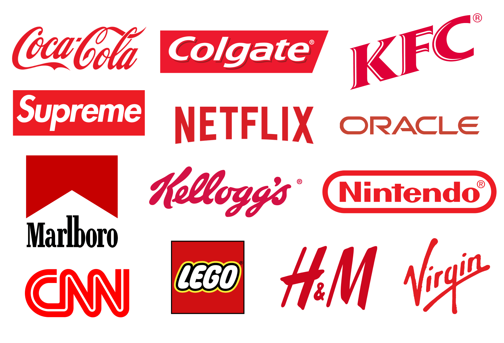
Many people think that colours carry some meaning which they can’t shake off. Allegedly, green colours are great for eco-brands, blue works best for IT companies, yellow is the order of the day for fast food. There’s also the commonly-held wisdom that colours evoke emotions, green is calming, yellow is cheerful, and other such nonsensical statements.
The reality is, as always, more boring. Colour means nothing. Red is red — not a symbol of aggression or anything else. And that’s why brands like Netflix, Marlboro and H&M use it without fear of coming across as bloodthirsty warriors.
Tip 2: Choose a colour that marks you out from your competitors
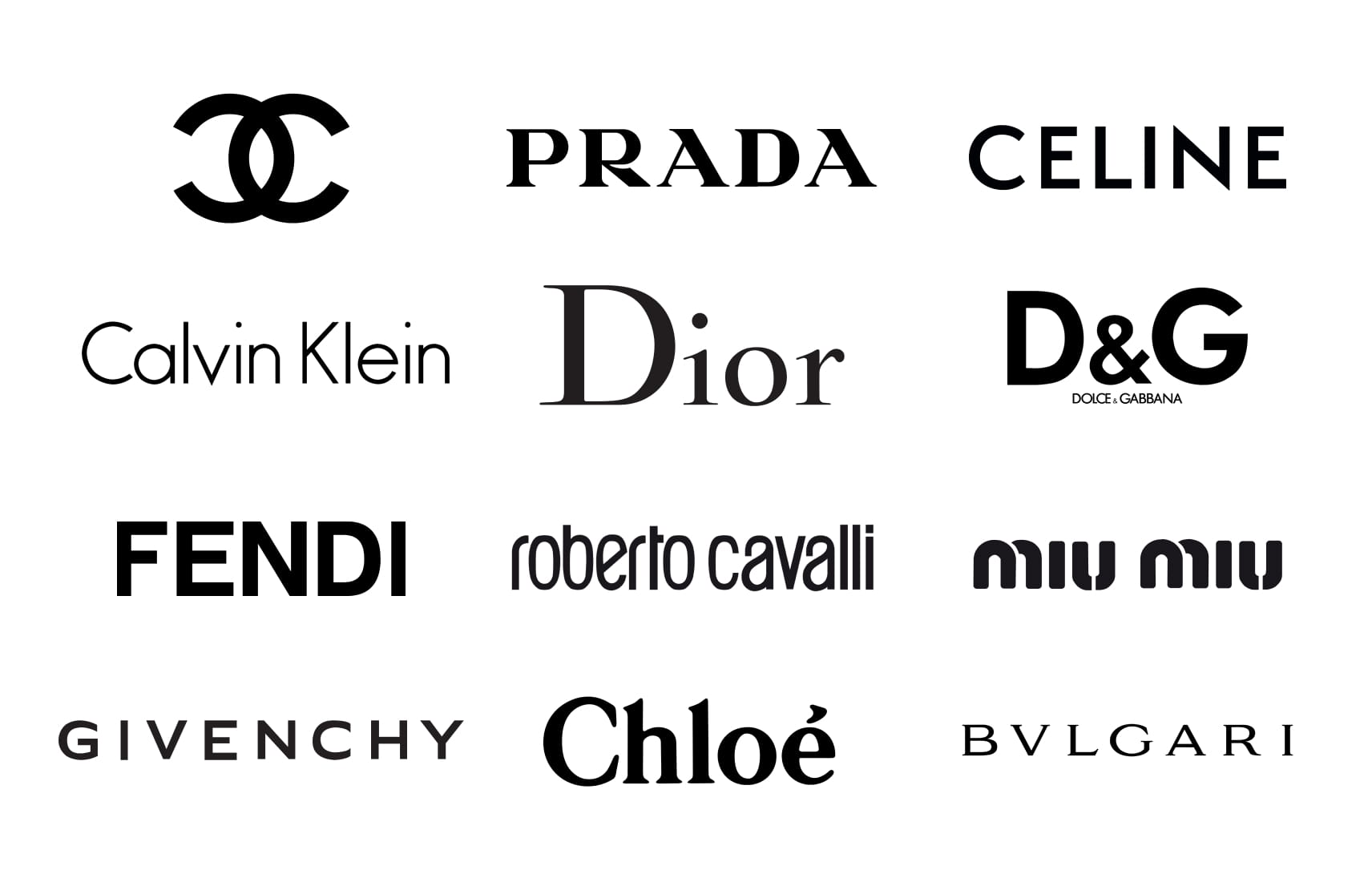
The task of a logo is to be a distinctive. Your brand is competing in a marketplace with other companies, so it's logical that you should choose a different colour for your logo than your direct competitors use.
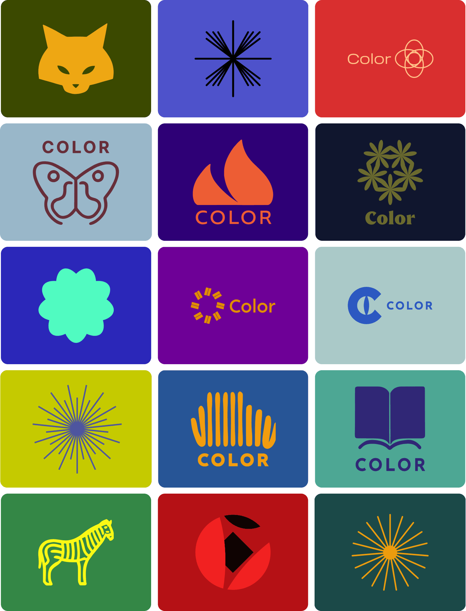
For example, this is what the logos of most clothing brands look like.
And this is what the Lacoste logo looks like.
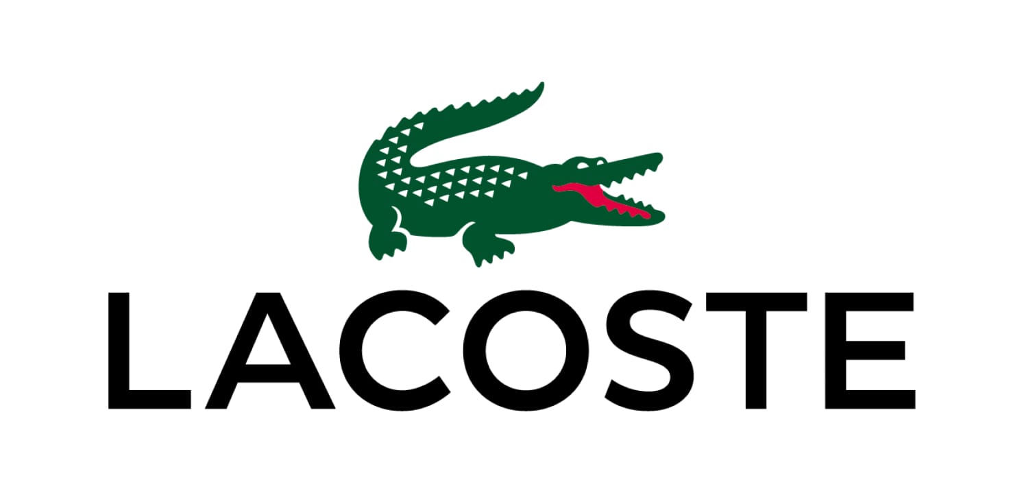
Whose logo is easier to remember?
Tip 3: Consider the context
Remember that people are going to see your logo in real life, rather than in a layout — on signs, packaging, merch, in their socials. Before choosing a colour, think about the logo itself — sure, but also pay some attention to the context in which it will exist.
Where will your logo be seen? How will it fit in with the background? How will people interact with it? All of these are important points of consideration when choosing a colour.
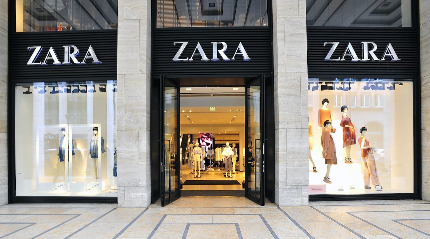
Take the Zara brand logo, for example. It’s usually found on historic buildings or inside malls. People see it pretty close up, so both the logo and the background behind it come in fairly discreet colours. The logo doesn’t need to attract any attention, people are going to find the store anyway.

The IKEA logo, on the other hand, is strapped onto huge shopping centres located on the outskirts of cities. People flood to IKEA in cars and buses, so the logo must be visible from a distance. The contrasting yellow and blue goes a long way to helping with this.c

Tip 4. Use colour combination palettes
Colour palettes are special combinations of colours that are selected because they complement each other perfectly. These kinds of palettes are used by artists, designers, stylists, decorators and other people who work in the wonderful world of colour.
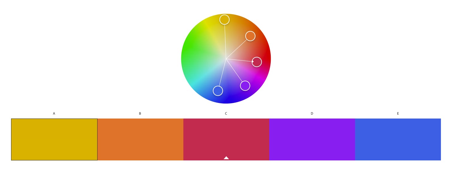  |
Palettes can help you to pick out successful combinations and shades that complement each other.
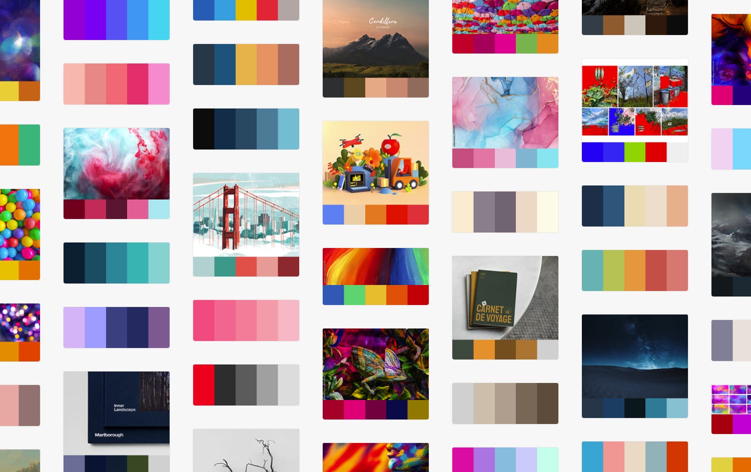
Try Ironov's free color palette generator to create stunning color schemes for your business.
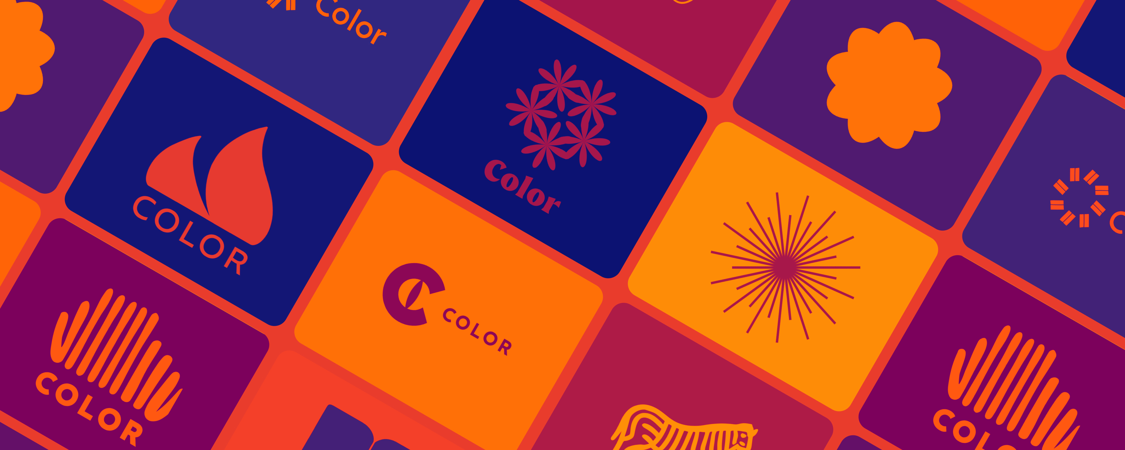
Tip 5. Try Ironov
Ironov is a neural network that develops logos and identities. Ironov is clever enough to be able to find an infinite number of colour combinations.
Nikolay uses the magic of maths to seek out complementary colours, and because of this, he finds combinations that a living person would struggle to come up with.
Here are some examples of colour combinations that Ironov has suggested.
 |
 What is Brand Identity and Why Does Your Business Need It?
  Brand Identity – Creating a Unique Image for Your Company
  What Is a Target Audience and Why It Matters for Your Brand