How to tell bad design from good

| This article is a collection of observations on good and bad design in everything from logos and websites to urbanism. We’ll show you how to evaluate someone else's design properly, and what to keep in mind before embarking on creating your own. |
The theory
The saying goes that good design is beautiful design. Sounds logical, but it's a little more complicated than that.
Beauty is a relative concept. In 1785, a dress like this would have been considered beautiful:
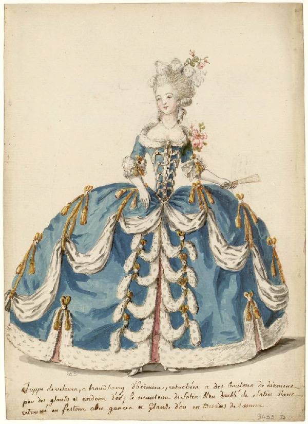 |
Source: flickr.com |
Whereas in 2022, we have this:
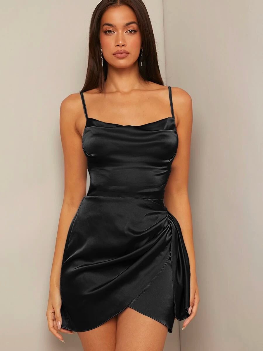 |
Source: Most Popular section of Shein Store |
Imagine if a fashion designer time-machined their way over to the 18th century and showed them the dress from 2022. Nobody would be applauding its aesthetic. For the 18th century, this particular number would be far too strange for their sensibilities. It would be totally out of context, and, because of that, nobody would be able to appreciate its beauty.
Good design is practical, not aesthetic. It has three characteristics:
• Context
• Contrast
• Content
Context
Without context, it’s impossible to understand whether a design is good or bad—whether it works or not. But what is context? Let's have an example.
Here’s a poster for the movie One More Year. Do you think it’s ineffably cool or slightly creepy? Without any additional input it may be difficult to say.
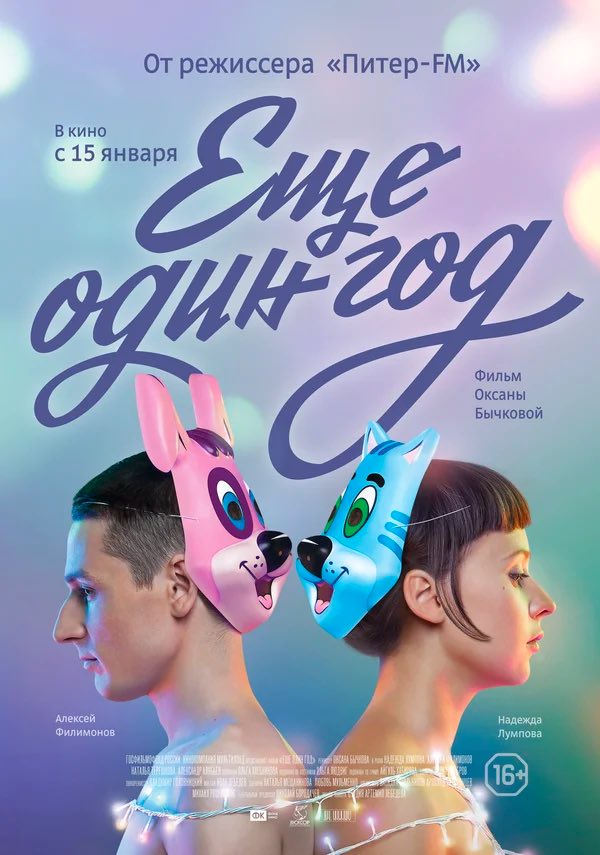
So here’s some detail.
One More Year is a Russian film, released on December 4 and shown in the run-up to the New Year and the holidays. In Russia, New Year's Eve films are an entirely separate genre with its very own audience. People go to see these films to stir up their emotions, and bask in a sense of wonder and celebration. The designer’s task, then, is to show that the film is genuinely capable of generating a New Year's vibe. That’s why this poster has a ribbon font and sparkly lights.
Right above the girl's chest, we can see the 16+ rating. This also performs an important function. A healthy portion of the audience will be people who have come to see the film on a date. They’re interested in relationships (obviously), and they’re going to the cinema to hold hands and get close. The 16+ rating signals that there will be some racy scenes in the film, hooking those viewers who are looking for something to stir the senses.
At the same time, the poster looks innocent enough, because One More Year is a remake of the Soviet film Do not part with your loved ones. The distributor assumed that older people would be interested primarily in the melodrama, and didn’t want them to conclude that this would just be another vulgar youth comedy. So, the calligraphy in the title is a callback to the fonts used on Soviet film posters.
And last of all, the film poster was developed for a relatively low-budget Russian film. Advertising for films like this is not likely to be seen on huge billboards in the city center. Cinema owners and managers print A2 or A4 posters themselves and hang them wherever they see fit. In December, cinemas are generally fairly dark places. If the poster is also dark, it won't be visible to the naked eye. Because of this, the designer went for light colors to make sure the poster stands out.
All of the above makes up a context through which one can understand whether the design works or not. A poster isn’t just there to look pretty. It performs these important functions:
• attracting 3 different audiences (fans of New Year's films, melodramas, and Soviet cinema), and;
• advertising the film in cinemas for those who have not decided what to watch.
That's how good design works.
Practice. Before creating any design (whether its a website or a spaceship), it’s worth considering how people will interact with the finished object. Where will they see it? Under what circumstances? In which environment? Is it often used or not? Is it dangerous if it breaks?
The more questions you ask and answer, the higher the chance that the design will be a success.
Contrast
The second hallmark of effective design is contrast. Contrast is all about the visibility of any difference.
For example, an element within a design may be different. So, in the screenshot of a racing tournament broadcast, the speed is most noticeable. This is the most important (and therefore the most prominent) detail.

Or the design might contrast with the competition. This is what most drag racing championship logos look like.
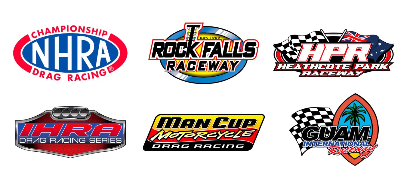 And this is what the logo of the Russian championship looks like.
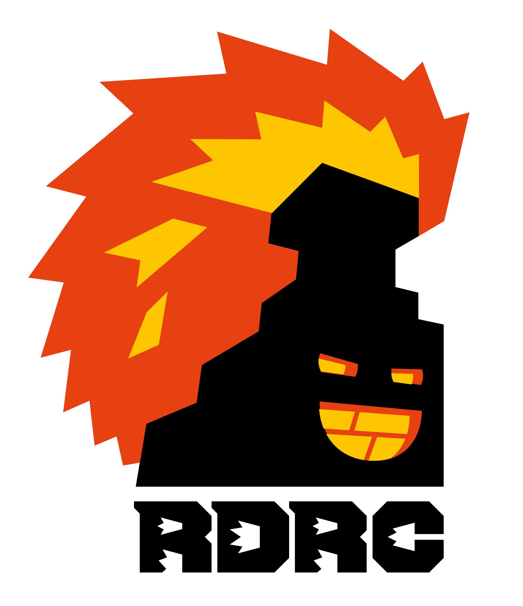
No prizes for guessing which logo is easiest to remember.
Practice. When designing, don’t forget about the contrast. It makes sense to think about which elements to highlight and which ones to tone down, and assess whether the overall design stands out from the competition.
Recommendation. If you need a logo design, you should have a look at Nikolay Ironov—a neural network that develops high-contrast logos that will help you to stand out from your competitors. Ironov thinks differently from us, which is exactly why his work is so memorable.
 |
Content
Content is everything that makes up the finished design.
When it comes to a fashion magazine, the content is photos and things. If we’re talking about an ecommerce site, the content is photos of products, descriptions under them, buttons, searchability, and so on.
The importance of content is often overlooked. Many people believe that coming up with a beautiful logo is enough, and the ideas embedded within are of little to no importance.
The reality is that just as you can't build a good house out of bad materials, you can't make good design out of bad content.
The quality of the content determines the content of the future product. Even when a fashion catalog is excellently laid out, it will still be rubbish if it has bad photos, items, and models. A PC game with a well-thought-out story and spectacular graphics is worth nothing if it doesn't load.
Practice. Before designing, try to prepare content of the highest quality. The better the quality of the content, the more opportunities it will create.
 How the Logo and Corporate Identity Affect Brand Recognition
  Brand Identity – Creating a Unique Image for Your Company
  Gradients in Logo Design: Secrets of Effective Application for Your Brand