Seven mistakes in logo design


| Creating a logo that effectively represents your brand involves more than just aesthetics. This article addresses the seven most common mistakes people make when designing or evaluating a logo, and how you can avoid them to ensure your logo is both memorable and professional. |
Mistake 1: Bad composition
Bad composition can significantly impact the effectiveness of a logo. Common compositional issues include:
- Asymmetry: Uneven placement of elements can make a logo appear unbalanced.
- Spacing Issues: Elements that are too close or too far apart can disrupt the visual harmony.
- Dangling Elements: Design elements that seem disconnected or poorly aligned.
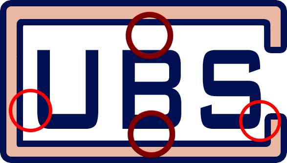
Example of Bad Composition: The UBS logo demonstrates how poor arrangement can negatively affect a logo’s perception.

UBS logo
Mistake 2: Dodgy colors
Color plays a crucial role in logo design, and incorrect usage can lead to problems such as:
- Too Many Colors: Overcomplicating the color scheme can dilute the logo’s impact.
- Jarring Combinations: Mismatched hues can create visual discomfort.
Tools for Color Selection:
- Color Palettes: Use tools like Ironov's color palette generator to find harmonious color combinations.
- Ironov’s Color Analysis: Ironov provides an infinite array of balanced color combinations through advanced algorithms.

For more information on colour selection, see the article "How to choose a logo colour".

Mistake 3: Outdated style
Outdated logos hurt a business because they make the company look like its best days are long gone. So, it’s a good idea to regularly update your logo to reflect contemporary design trends and ensure it remains relevant.
Here are the main signs of a logo which has outlived its purpose today.
Lousy shadowing

Excessive gloss

Mistake 4: ‘Trendy’ styling
With fashionable logos, one problem is that everyone jumps on board and does the same thing. Take black and white text logos—once the height of fashion. At the time, a stampede of clothing brands simultaneously updated their design and all the logos ended up looking the same.

Mistake 5: Too much information
Logos bulging at the seams with details look awful in small formats—social network avatars, business cards, pens and letterheads. They look great in large formats but, truth be told, logos are rarely used this way.
|
|
|
Large size |
Nothing is visible in small size |
Mistake 6: Ambiguity
It never hurts to check if the logo might be perceived in two or more ways. To do this, workshop it with a few friends who weren’t part of the creative process.
Try not to skip this stage, otherwise things may turn out a little awkward. For example, the logos for the A-style clothing brand and the American Center for Pediatrics raised a few eyebrows because so many people associate them with something other than sports and children.
|
|
|
A-style clothing brand logo |
American Center for Pediatrics logo |
Mistake 7: Stock images
It's awesome when the logo makes it immediately clear what the company does. But it’s bad if the image is so common that it’s a hyper-cliche. Avoid using obvious symbols in your logo.
The most unusual images for logos come courtesy of Ironov, whose artificial design intelligence allows him to think more freely than people. This makes for some frighteningly original solutions.
Here are the logos Ironov came up with for dental clinic Smile.
 |


