Logo Types: Breakdown with Examples and Pre‑Launch Tests
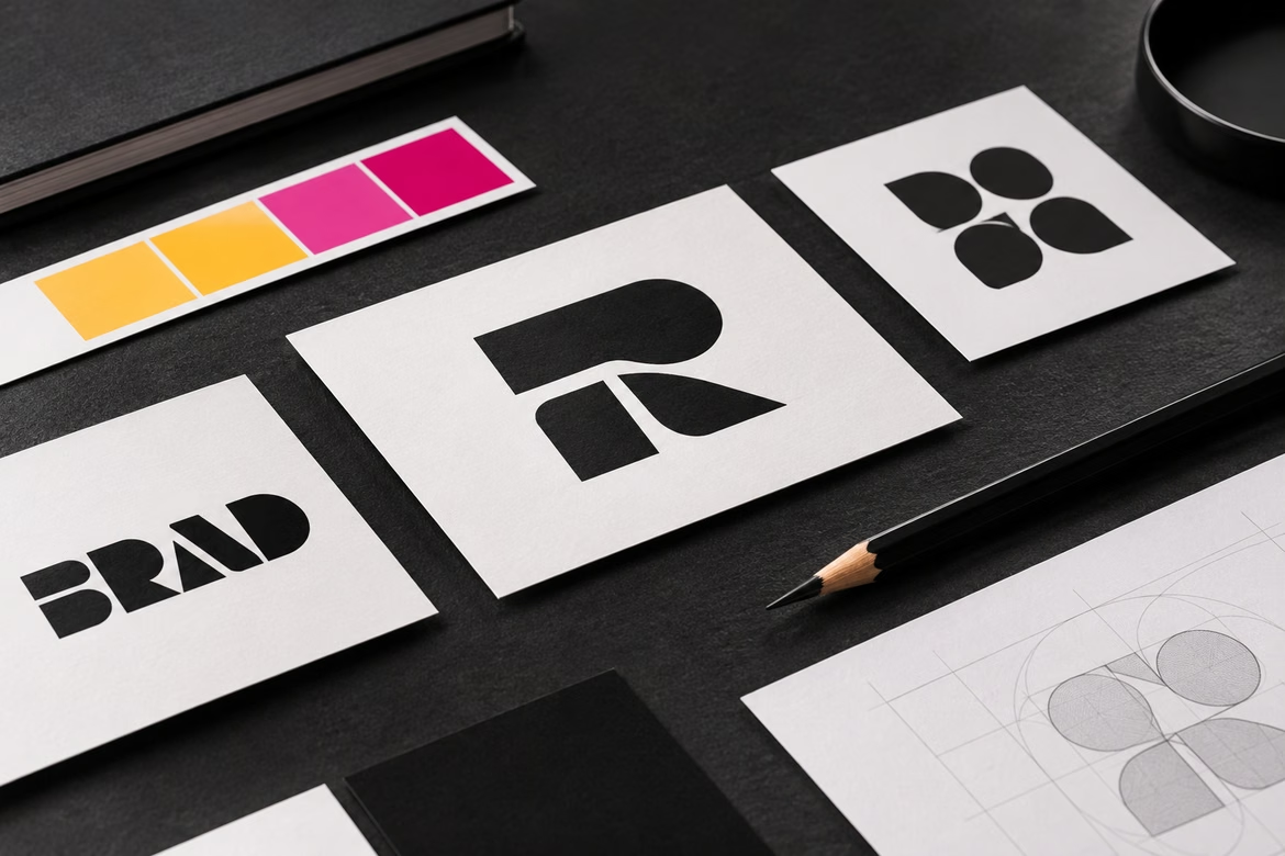

A logo is the main visual identifier of a brand. It hints at the business area, sets the mood, and works at every touchpoint: from a 16×16 favicon to a highway billboard. Logo types are classified by composition — what the mark is made of: text, symbol, or a combination. The composition determines how the mark scales across media, how it’s handled in trademark registration, and how it holds the audience’s attention.
This article covers what makes up a logo, which types exist and their limits, which tests to run before launch, and how to get an identity quickly.
Logo Anatomy: What Makes Up a Mark
Any logo shares the same components; only their proportion changes.
- Typeface. The main carrier of character. A sans‑serif grotesque reads as tech-forward; serif fonts signal reliability and tradition; hand-lettering conveys individuality. The only constant requirement: legibility at a specific size and context.
- Symbol (pictogram). A graphic that can stand alone without text — like the Nike swoosh or the bitten Apple logo.
- Color. Drives perception before reading the text: blue suggests reliability, red signals energy and appetite, green stands for nature and health. Practical rule: use no more than 2–3 colors plus a neutral tone; otherwise, the palette won’t hold up in print or small sizes.
- Shape. Rounded contours feel friendly; sharp angles and symmetry convey strictness and stability.
- Design treatments. Outlines, fills, shadows, textures. These are also components — and the ones most often stripped down in simplified versions.
All usage rules are documented in a logobook or brandbook — a document with mark versions, safe zones, minimum sizes, and a list of prohibited scenarios.
Five Logo Types
Classification by composition includes five groups.
| Type | Composition | Best For | Key Strength |
|---|---|---|---|
| Wordmark | Company name | Brands with short, catchy names | Directly reinforces brand name recall |
| Monogram | Initials, abbreviation | Long names, international brands | Compact on all media |
| Pictorial (symbol) | Symbol without text | Digital environments, established brands | Instant recognition without words |
| Combination mark | Symbol + name | Most new brands | Flexibility: full and condensed versions |
| Emblem | Text and symbol in a single form | Sports, education, government bodies | Solidity, sense of belonging |
Wordmark and Monogram Logos
You don’t need a symbol if the name is short and memorable. A wordmark locks the name in memory; a monogram saves space on media and is culturally neutral. The typeface defines the character: elegant script fonts suit restaurants and fashion brands; geometric sans serifs fit startups and tech companies. A letter can become a standalone image: in the Motomafia logo, the “M” reads as a motorcycle silhouette, a helmet, and a mascot cat at once. Practical tip: custom lettering is easier to protect as a trademark — hand-drawn letters are less likely to resemble existing registered marks than standard fonts.
Pictorial Logo
The symbol replaces the text: an abstract shape or stylized object — a building for a developer, a steaming cup for a coffee shop. The goal is an image that evokes the brand even without copy. Caveat: an abstract symbol tells nothing about the business at launch, so pure pictorial marks mostly work for already recognizable brands. For a new brand, a combination mark is usually better — over time, the symbol can “detach” and live on its own.
Mascot Logo
A character becomes the brand’s face: Matroskin the cat, Duo the owl, Uni’s Goodboy from Unisender. A mascot builds emotional connection and lives beyond the logo — in social media, ads, and support. Since 2024–2025, mascots have returned to identity systems as permanent elements, not one-off campaigns — especially for digital services where communication often feels impersonal.
Combination Mark
Symbol plus name is the most common and flexible type: full version for packaging, standalone symbol for app icons. This adaptability makes it the default recommendation for most new brands.
Emblem
Text integrated into a frame, crest, or object outline (helm, ball, shield). It conveys heritage and solidity, which is why sports clubs, universities, and government bodies use emblems. Caveat: the text and symbol inside the emblem aren’t separable; emblems scale poorly and are rare in mobile interfaces.
A brand usually needs several versions of the same logo: main, compact, monochrome, app icon, motion version. These aren’t extras — they’re basic requirements for an omnichannel environment: the mark must work in apps, marketplaces, stories, and on physical media without losing character.
Five Pre-Launch Tests for a Logo
Before the mark goes into the brandbook, it should pass mandatory tests. Each test catches a specific class of errors.
- Favicon test. Shrink the mark to 16×16 pixels. If it’s unreadable, it fails where users see it most: browser tabs and app lists.
- Monochrome test. Convert the logo to a single color. If recognition vanishes without brand colors, you’ve got a picture, not a mark. This test quickly reveals overreliance on gradients.
- Production method test. The toughest conditions are embroidery, embossing, engraving, pad printing. Lines thinner than 0.3–0.4 mm “fill in” with thread in embroidery and disappear in engraving. If the logo will live on merch and plaques, set stroke thicknesses at the design stage, not later.
- Bend test. For packaging, check the mark on folded cardboard and cylindrical surfaces (a can label): a symmetrical mark can “break” against the geometry of the container.
- Trademarkability test. Before registration, check for similarity to existing trademarks in relevant Nice classes. This is the most expensive mistake: a mark someone else has already claimed must be reworked after printing a run.
Selection Process: Positioning First, Type Second
The type isn’t a menu option — it’s a consequence of positioning. The right order: archetype - audience intent - list of media - logo type. The reverse (“I like monograms, let’s do a monogram”) is the most common mistake: the mark conflicts with packaging and photostyle, and the identity falls apart.
- Define brand goals and values. The mark type follows the positioning: focus on the name — choose wordmark or monogram; focus on emotion — choose a mascot; focus on versatility — choose a combination mark.
- Identify the audience. Young audiences tolerate boldness; business audiences expect clarity and restraint.
- Analyze competitors. If the whole niche uses symbols, a typographic solution or a character can help you stand out; if everyone uses wordmarks, a graphic mark can differentiate you.
- Consider the production budget for media. A digital-first tech company is free to use effects. A restaurant needs a version that prints correctly on packaging; a merch producer needs a version suitable for embroidery.
- Run the tests listed above before finalizing, not after.
Common Mistakes
- Lines and details that fall apart at small sizes — in icons and embroidery.
- A mark that’s unreadable without brand colors and lacks a monochrome print version.
- Copying competitors’ visual codes instead of finding your own distinguishing feature.
- No versions for different media — leading to inconsistent communications.
- Choosing a type before defining positioning.
- Using an emblem where a standalone symbol is needed: text inside a frame doesn’t scale to an app icon.
FAQ
What’s the difference between a typographic and a pictorial logo?
A typographic logo is based on the name (wordmark or monogram); a pictorial one relies on a graphic symbol without text. Typographic marks boost name recall; pictorial ones drive instant visual recognition.
Which logo type suits a new brand?
Usually a combination mark: it’s flexible, adapts to media, and lets you use both the name and the symbol separately.
How is an emblem different from a combination mark?
In an emblem, text and symbol are locked into a single form and can’t be used separately. In a combination mark, the elements are independent.
When is a monogram better than the full name?
When the name is long, targets an international audience, or doesn’t fit all media: initials are more compact and culturally neutral.
Are multiple logo versions mandatory?
Yes. A minimum set includes main, compact, monochrome, icon, and motion versions — otherwise the mark won’t survive an omnichannel environment.
What do you check before trademark registration?
Similarity to existing trademarks in the relevant Nice classes — plus legibility at small sizes, in embroidery, and in monochrome.
Conclusion
Logo type answers the question “what is it made of”: name, initials, symbol, their combination, or a symbol within a unified form. The choice should be based on positioning, audience, niche, and media list — not personal taste. Running the favicon and monochrome tests, preparing versions for media, and accounting for production limits turns a logo into a true brand identity carrier, not just a pretty picture.
 How to Protect Your Logo: Understanding Copyright and Trademark Registration
 Comparison of presentation builders. How to choose the best presentation service
 Logo Design Guide: Rules, Process, and Practical Checks