Logo Design Guide: Rules, Process, and Practical Checks
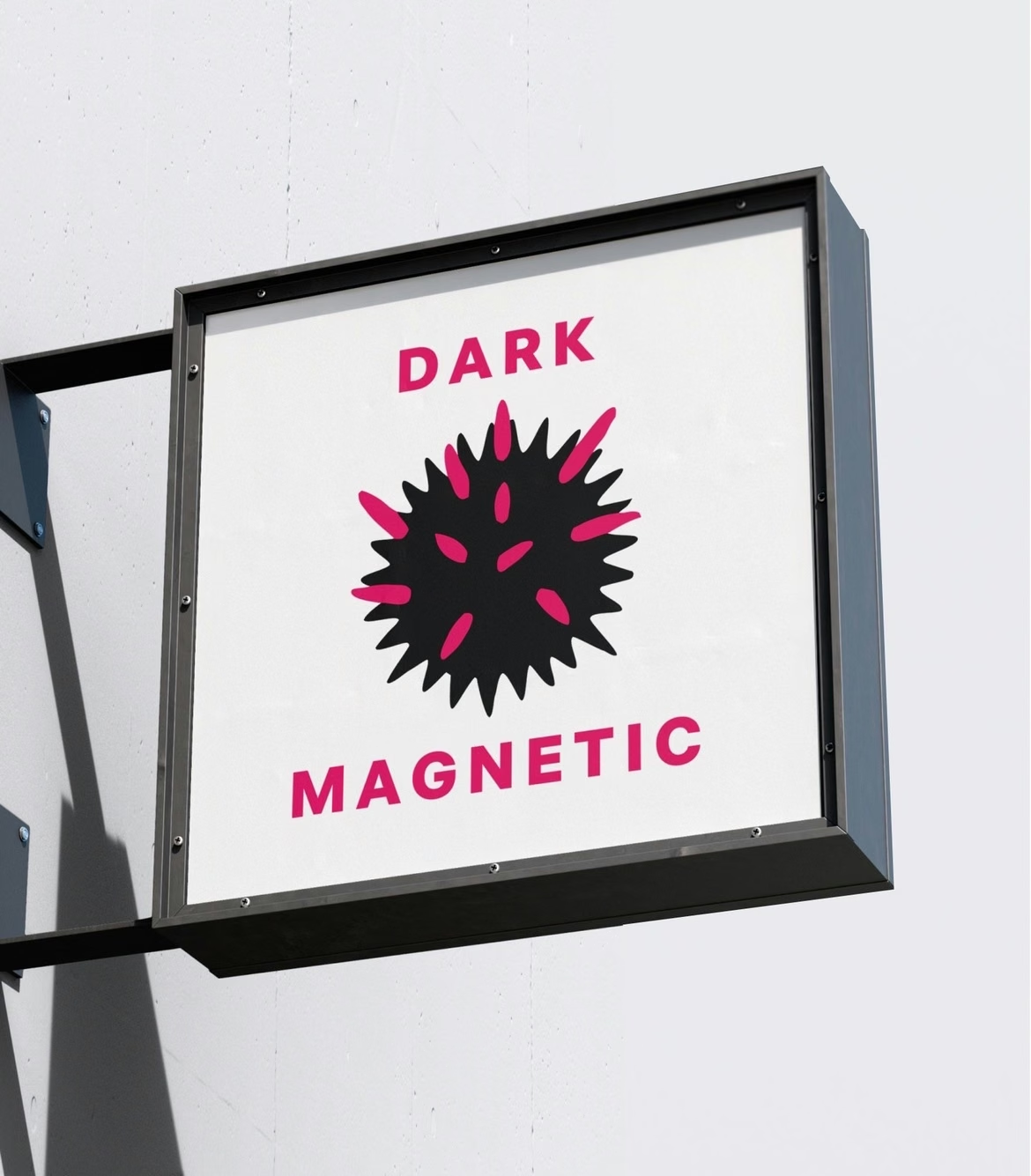

A logo is a visual identifier for a company or brand, by which it’s easily recognized. Logo development is a crucial stage in forming a brand’s image: the mark reflects the mission and values through visual imagery and associations. This article covers the rules for creating a good logo, the design process, and criteria to test the result in practice.
Where to Start: A Short Plan
- Idea. Formulate what the logo communicates: quality, speed, premium status, care.
- Audience. Understand who the mark is for: age, tastes, context of consumption.
- Type and Style. Choose a graphic, text, or combined logo and a stylistic direction.
- Colors. Limit to 1–3 main colors with clear associations.
- Font. Pick a readable font that pairs well with the symbol.
- Sketches. Make drafts and narrow down to 3–5 directions.
- Testing. Evaluate against: simplicity, adaptability, relevance, future‑proofing, appropriateness.
Next are the details for each point.
What Is a Logo
A logo is the visual identifier of a company or brand by which it’s easily recognized. It’s sometimes called a brand mark. The logo development process is a key stage in shaping a brand’s image: it reflects the mission and values via visual imagery and associations.
Main functions of a logo:
- Forming associations. The logo constantly reminds people of the brand, evoking positive, clear associations without double or negative meanings.
- Communication. The brand speaks to the audience through the logo on websites, social media, outdoor ads, signage, or packaging.
- Attention grabbing. A memorable, expressive logo quickly catches the eye and helps engage potential customers, even if they don’t yet know the product or service.
- Information transfer. The logo tells about key characteristics of the company or product, highlighting history, core idea, and values.
- Identification. A well‑designed logo helps stand out from competitors and build a recognizable image.
- Symbolism. In premium brands (e.g., fashion or cars), even a restrained logo adds status and prestige to the product and its owner.
- Visual aesthetics. A good logo becomes part of the overall style solution, harmonizing with shape, color scheme, fonts, and stylistic traits.
What’s tested in practice: the logo is tested for recognizability without the brand name—if the mark isn’t clear on its own, the identification function isn’t working.
Signs of a Good Logo
Logos are often judged subjectively (“I like it or not”), usually about shape or color. But there are objective criteria:
- Reflects the company’s activity or key product traits. Example: Instagram’s logo reflects the idea of vibrant photos shared via a smartphone app.
- Memorable and stands out. Example: McDonald’s logo is instantly noticeable and sticks in the mind.
- Readable across media, in color and black‑and‑white, small and large sizes. This matters when used online and offline, printed on clothing and posters.
- Harmonious composition and color palette. It shouldn’t cause visual rejection or clash with other design elements.
- Matches the style and target audience. Even a 2000s‑style logo with lots of detail and bright colors can be appropriate—for example, for a nostalgic capsule collection aimed at audiences over 35.
What’s tested in practice: show the mark to a focus group without the brand name. If the audience can’t guess the industry, the “reflects activity” criterion isn’t met.
Logo Types and Styles
There are three main logo types:
- Graphic. Only a visual symbol, sometimes with one or two letters (rarely numbers). These are recognizable images: people, animals, plants, or just geometric shapes and lines. Custom drawings and brand colors are used to make the logo distinctive.
- Text. Based on the company or product name. This immediately tells what the brand is about and works well for brands with short names or abstract products that are hard to visualize. Custom fonts or unique graphic elements boost memorability.
- Combined. Text and graphics work together. Sometimes the year of foundation, country, or a slogan is added.
In terms of style, a logo can:
- Follow a specific art style (e.g., Gothic or Art Nouveau).
- Align with current design trends (e.g., minimalism or contrasting colors).
- Match the company’s brand spirit and identity.
What’s tested in practice: match the logo type to its media—a text logo may lose readability as an app icon; a graphic logo may not work well on a narrow signboard.
Logo Creation Stages
1. Preparation
Before designing the logo, clarify all inputs with the client:
- What should the logo be like?
- What idea should it embody?
- Who is the target audience?
- Where and on which media will it be used?
- Are there any references (examples the client likes)?
- If the client already has a brand book and style guide, include these materials. If there’s an existing logo to redesign, find out what’s wrong with the current one.
This stage is vital: the deeper the designer understands the client’s world and expectations, the easier it is to choose the right direction—and avoid endless revisions. Then, agree on deadlines and price.
What’s tested in practice: keep the brief in writing—if the client changes their mind later, the written inputs protect against constant reworks.
2. Sketching
After reviewing references and inputs, the designer starts creating logo elements: they make rough drafts in graphic editors, explore different versions, and share them with the client. The client picks favorites, and the designer continues in that direction. Before sketching, it can help to look for inspiration among other logos in the same field or with similar goals.
What’s tested in practice: at the sketch stage, show black‑and‑white versions—color can hide a weak form.
3. Drafting First Versions
The designer refines the version(s) the client selected, working on shape, colors, and font. Then they send 3–5 versions for the client to choose from. Often, several rounds of revisions are needed to reach a satisfactory result.
At this stage, pay attention to form and color—they subconsciously affect the viewer. For example, an upward‑pointing triangle symbolizes strength and energy; white symbolizes softness and purity. For text logos, the font is equally important.
What’s tested in practice: test versions at real sizes—on a business card, avatar, or signboard—not just on a large screen.
4. Final Refinement
The chosen logo version is polished for perfect composition, clean lines, and a harmonious color palette—so it reads well on all media, in black‑and‑white and color.
What’s tested in practice: check scaling—from favicon to banner—without losing readability.
5. Brand Book
This step is needed if the goal is not just a logo but a full brand identity. The designer selects brand colors and fonts, creates a catalog of logo versions for different media, and, if needed, prepares simplified versions for icons and apps.
Later, the logo can be registered as a trademark to protect against plagiarism and prevent others from using it for unrelated goods or services.
If a single designer handles the project, they do all these steps themselves. If a creative agency or design studio works on it, a creative director, art director, and project manager help: they handle client talks, find references, run audience research with focus groups, provide feedback, and set the creative direction. Usually, this means delivering not just a logo, but a full “turnkey” brand identity and style guide.
What’s tested in practice: the brand book documents restrictions—minimum size, safe zone, unacceptable background colors.
Basic Logo Design Rules
- Simplicity. The more concise the logo, the easier it is for the company to reproduce it across media and for customers to recognize and remember.
- Expressiveness. The logo should convey the intended idea, emotions, or imagery as clearly as possible.
- Timelessness. A logo should stand the test of time and not look outdated. A balance between classic and modern trends helps. That doesn’t mean a company can’t refresh its logo later via rebranding to make it more compact, clear, and relevant.
- No more than four colors. Two or three colors are ideal to create the right effect, evoke emotions, and make the logo recognizable. Too many colors complicate perception and memorability.
- Negative space. Instead of overloading with details, leave enough empty space in the design. This balances the composition and lets viewers quickly and comfortably take in all elements.
What’s tested in practice: each rule corresponds to an evaluation criterion from the next section—the rules and checks form matching pairs.
How to Evaluate the Result
Once the logo is ready, evaluate how good it is by checking these five parameters:
- Simplicity. Contains 1–2 central figures; isn’t overloaded with small details; uses 1–3 main colors without many shades or gradients; has enough space around key elements; conveys 1–2 core ideas.
- Adaptability. Keeps meaning in black‑and‑white; stays legible when reduced to a keychain or pen size; scales to banner size without quality loss.
- Relevance. Doesn’t look outdated (e.g., no heavy shadows, highlights, or 3D effects). The only exception is a deliberate retro style choice.
- Future‑proofing. Aligns with the company’s long‑term plans.
- Appropriateness. Any slogan fits naturally and complements the image; colors evoke the right associations; the image is clear and doesn’t carry unintended meanings.
What’s tested in practice: simplicity test—show the mark to acquaintances and ask them to draw it from memory. If they can, it’s simple and memorable.
Common Logo Design Mistakes
- Designing the logo apart from the brand’s ideas and values. For example, a mental health support service shouldn’t have an aggressive, overwhelming logo.
- Overloading with details, shadows, and gradients. Such a logo is hard to see and remember, and becomes illegible in small size or black‑and‑white.
- Too obvious first‑order associations. E.g., a dress for a women’s clothing brand or a heart for a dating service. These don’t stand out, fail to show unique value, and blend in with many similar logos.
- Too deep symbolism or ambiguous meaning. This confuses potential customers and creates unwanted associations.
What’s tested in practice: every mistake is the opposite of an evaluation criterion. Overloading breaks simplicity; disconnect from values breaks appropriateness.
Frequently Asked Questions
Is logo creation free?
Free tools offer template solutions. A unique logo that meets evaluation criteria and doesn’t copy competitors is created by a designer or in a graphic editor.
Can I create a logo myself?
Self‑creation is possible: define the idea, study the target audience’s tastes and interests, choose style, colors, font, make sketches, and test. The challenge lies in final refinement and preparing versions for different media.
Where is a logo created?
In graphic editors and design tools. The right tool depends on the task: one for sketches, another for the final vector version.
In Brief
A logo is an image or symbol associated with a business or product. It can be graphic, text‑based, or a combination of elements. A logo helps a business differentiate from competitors, communicate its meanings and values to customers, and influence their choices.
You can create a brand mark yourself. Start by defining the idea you want to convey and studying the tastes and interests of your target audience. During design, you can look at successful solutions from other brands for inspiration.
Different tools are used to create logos. Simple options and sketches can be done in design builders or drawn by hand. Unique illustrations are created in graphic editors.
After creating the logo, evaluate the result. The brand element should be simple, relevant, easily scalable, and aligned with the company’s future plans.
 Comparison of presentation builders. How to choose the best presentation service Logo Design Guide: Rules, Process, and Practical Checks
 How to Create a Stunning Logo with Nikolay Ironov: A Comprehensive Guide